Building a Loading Spinner can improve HTML, CSS, and animation skills. Neumorphism UI enhances user experience by using light and shadow. Improving hierarchy and relationships between elements in the interface.
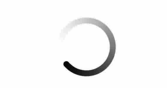
You will discover how to craft an attractive Loading Spinner utilizing Neumorphism UI with HTML and CSS. Even if you have no prior experience in HTML and CSS, you will be able to make this spinner with ease. Neumorphism UI is a design style combining 3D elements and shadows for a subtle look with depth. “Neumorphism” is a term combining “new” and “skeuomorphism.”
Steps Required To create Spinner Loading
this process involves just two steps.
1. File Structure
For starters, we will establish a new directory for our project. You can name it as you wish and within that directory, create two files named index.html and style.css. These files will hold the HTML and CSS code required for the Neumorphism Loading Spinner.
2. Creating the Neumorphism Loading Spinner
In the next step, we will design the layout and enhance the appearance of the spinner using HTML and CSS. To do this, add the following HTML code to your index.html file to establish the basic structure of the spinner.
<!DOCTYPE html>
<html lang="en">
  <head>
    <meta charset="UTF-8" />
    <meta http-equiv="X-UA-Compatible" content="IE=edge" />
    <meta name="viewport" content="width=device-width, initial-scale=1.0" />
    <title>Neumorphism Loading Spinner</title>
    <link rel="stylesheet" href="style.css" />
  </head>
  <body>
    <div class="wrapper">
      <span></span>
    </div>
  </body>
</html>
In your style.css file, add the following CSS code to style the loading spinner.
* {
  margin: 0;
  padding: 0;
  box-sizing: border-box;
}
body {
  min-height: 100vh;
  display: flex;
  align-items: center;
  justify-content: center;
  background-color: #f1f1f1;
}
.wrapper {
  position: relative;
  display: flex;
  align-items: center;
  justify-content: center;
  height: 300px;
  width: 300px;
  border-radius: 50%;
  box-shadow: inset -10px -10px 15px rgba(255, 255, 255, 1),
    inset 10px 10px 10px rgba(0, 0, 0, 0.1);
}
.wrapper::before {
  content: "";
  position: absolute;
  height: 200px;
  width: 200px;
  border-radius: 50%;
  box-shadow: -10px -10px 15px rgba(255, 255, 255, 1),
    10px 10px 10px rgba(0, 0, 0, 0.1);
}
span {
  height: 186px;
  width: 220px;
  position: absolute;
  animation: rotate 5s linear infinite;
}
@keyframes rotate {
  100% {
    transform: rotate(360deg);
  }
}
span::before {
  content: "";
  position: absolute;
  height: 30px;
  border-radius: 50%;
  width: 30px;
  background: linear-gradient(45deg, #336dff, #5c89ff);
  box-shadow: 0 5px 10px rgb(0 0 0 / 30%);
}
By following the steps in this blog post, you’ve learned how to create a Neumorphism Loading Spinner in HTML and CSS.