
Skills Bar is this combination of different skills that someone has, it is like the qualification of the particular person for the particular work. For example, if someone is a front end developer, then he has the knowledge of HTML, CSS, Adobe XD and basic JavaScript.
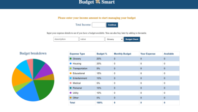
Let’s have a quick look at the given image of our project that we are going to create [Animated Skills Bar in HTML & CSS]. On the image, we can see a total of four bars. Every bar has a different title and percentage. When the page will refresh or open that percentage of skill got animated.
For the better, you can watch the real demo of our project [Animated Skills Bar in HTML & CSS] and all the HTML and CSS codes that I have used to create this project.
have provided all the HTML and CSS codes that I have used to create this animated skills bar. Before getting into the source code file, I would like to explain the given video tutorial for a piece of basic information to you.
As you have seen in the video tutorial of our project [Animated Skills Bar or Progress Bar]. At first, we have seen a total of four bars with different percentages and that is the actual percentage skills someone has for example. When I refreshed the webpage all the skill bars progressed one by one with beautiful animation. As you have got the idea for the animation for the skill’s percentage bar I have used CSS animation.
Now I believe, you can build this Skills Bar with Progressing Animation using HTML and CSS. If you are feeling difficulty creating this animated skills bar, I have provided all the HTML and CSS code below.
Index.html
<!DOCTYPE html>
<!-- Coding By CodingNepal - codingnepalweb.com -->
<html lang="en">
<head>
    <meta charset="UTF-8">
    <meta http-equiv="X-UA-Compatible" content="IE=edge">
    <meta name="viewport" content="width=device-width, initial-scale=1.0">

    <!----======== CSS ======== -->
    <link rel="stylesheet" href="style.css">

   <title>Animated Skills Bar</title>
</head>
<body>
    <div class="container">
        <div class="skill-box">
            <span class="title">HTML</span>

            <div class="skill-bar">
                <span class="skill-per html">
                    <span class="tooltip">90%</span>
                </span>
            </div>
        </div>

        <div class="skill-box">
            <span class="title">CSS</span>

            <div class="skill-bar">
                <span class="skill-per css">
                    <span class="tooltip">70%</span>
                </span>
            </div>
        </div>
        <div class="skill-box">
            <span class="title">JavaScript</span>

            <div class="skill-bar">
                <span class="skill-per javascript">
                    <span class="tooltip">50%</span>
                </span>
            </div>
        </div>
        <div class="skill-box">
            <span class="title">NodeJS</span>

            <div class="skill-bar">
                <span class="skill-per nodejs">
                    <span class="tooltip">30%</span>
                </span>
            </div>
        </div>
    </div>

</body>
</html>
Styles.css
/* ===== Google Font Import - Poppins ===== */
@import url('https://fonts.googleapis.com/css2?family=Poppins:wght@200;300;400;500;600&display=swap');
*{
    margin: 0;
    padding: 0;
    box-sizing: border-box;
    font-family: 'Poppins', sans-serif;
}
body{
    height: 100vh;
    display: flex;
    background: #4070f4;
    align-items: center;
    justify-content: center;
}
.container{
    position: relative;
    max-width: 500px;
    width: 100%;
    background: #fff;
    margin: 0 15px;
    padding: 10px 20px;
    border-radius: 7px;
}
.container .skill-box{
    width: 100%;
    margin: 25px 0;
}
.skill-box .title{
    display: block;
    font-size: 14px;
    font-weight: 600;
    color: #333;
}
.skill-box .skill-bar{
    height: 8px;
    width: 100%;
    border-radius: 6px;
    margin-top: 6px;
    background: rgba(0,0,0,0.1);
}
.skill-bar .skill-per{
    position: relative;
    display: block;
    height: 100%;
    width: 90%;
    border-radius: 6px;
    background: #4070f4;
    animation: progress 0.4s ease-in-out forwards;
    opacity: 0;
}
.skill-per.css{
    width: 70%;
    animation-delay: 0.1s;
}
.skill-per.javascript{
    width: 50%;
    animation-delay: 0.2s;
}
.skill-per.nodejs{
    width: 30%;
    animation-delay: 0.3s;
}
@keyframes progress {
    0%{
        width: 0;
        opacity: 1;
    }
    100%{
        opacity: 1;
    }
}
.skill-per .tooltip{
    position: absolute;
    right: -14px;
    top: -28px;
    font-size: 9px;
    font-weight: 500;
    color: #fff;
    padding: 2px 6px;
    border-radius: 3px;
    background: #4070f4;
    z-index: 1;
}
.tooltip::before{
    content: '';
    position: absolute;
    left: 50%;
    bottom: -2px;
    height: 10px;
    width: 10px;
    z-index: -1;
    background-color: #4070f4;
    transform: translateX(-50%) rotate(45deg);

}